As of 04/26/2024
Indus: 38,240 +153.86 +0.4%
Trans: 15,171 -126.01 -0.8%
Utils: 884 -10.33 -1.2%
Nasdaq: 15,928 +316.14 +2.0%
S&P 500: 5,100 +51.54 +1.0%
|
YTD
+1.5%
-4.6%
+0.3%
+6.1%
+6.9%
|
|
As of 04/26/2024
Indus: 38,240 +153.86 +0.4%
Trans: 15,171 -126.01 -0.8%
Utils: 884 -10.33 -1.2%
Nasdaq: 15,928 +316.14 +2.0%
S&P 500: 5,100 +51.54 +1.0%
|
YTD
+1.5%
-4.6%
+0.3%
+6.1%
+6.9%
|
|
As of 04/26/2024
Indus: 38,240 +153.86 +0.4%
Trans: 15,171 -126.01 -0.8%
Utils: 884 -10.33 -1.2%
Nasdaq: 15,928 +316.14 +2.0%
S&P 500: 5,100 +51.54 +1.0%
|
YTD
+1.5%
-4.6%
+0.3%
+6.1%
+6.9%
| |
|
| ||
Below is the updated forecast for 2024 as of the close on March 28, 2024. Captions appear below the pictures for guidance, so be sure to scroll down far enough to read them.
On some of the charts (all except the CPI chart) the prediction in red is based on the work of Edgar Lawrence Smith in the 1930s. Smith said that the stock market followed a 10-year cycle. Each year tended to repeat the behavior of the year a decade earlier. In other words, if you averaged all years ending in 1 (2001, 1991, 1981 and so on), that would give you a forecast for 2011. For 2012, you'd make a similar average, only use 2002, 1992, 1982, and so on. That's what I did for the market forecast charts which follow.
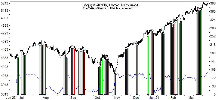
This is a chart of the Chart Pattern Indicator (CPI) on the daily scale.
The index continues to rise at a steady clip. The CPI is nervous, though. It changes from bearish (when we have a big down day) to neutral (white bar) to bullish (green vertical bar). Big moves can erase a signal for up to 7 days, so that's why you don't see a bearish red bar on the far right of the chart. The CPI line (bottom of chart) looks to be at or near the top of the scale (100).
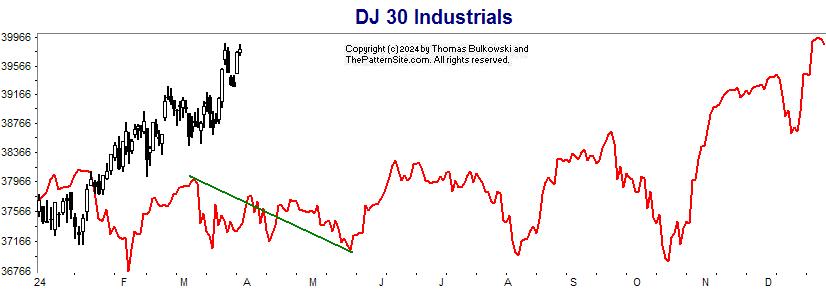
This is the Dow industrials on the daily scale. The forecast is in red. It shows the index moving lower going into May. However, the index diverged from the forecast back in January. It looks to be tied with the forecasted close for the year.
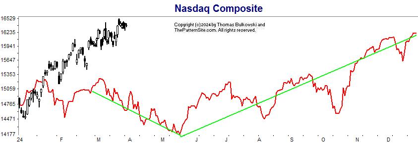
This is the Nasdaq. Same deal, here, as with the Nasdaq (prior chart). The index took off while the forecast slumped. After May, the forecast makes a big recovery. Maybe that will boost the index even higher.
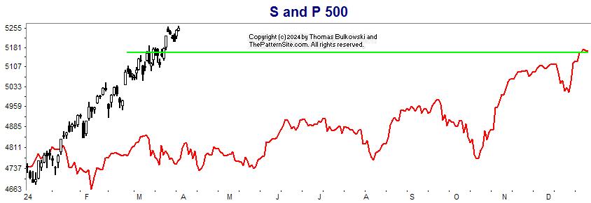
Here's the S&P 500 index on the daily scale for 2024
Notice that the index has already beat the forecast for the yearly close. All of these charts show the indices to be overheating and ripe for a retrace. So trade cautiously.
Support this site! Clicking any of the books (below) takes you to
Amazon.com If you buy ANYTHING while there, they pay for the referral.
Legal notice for paid links: "As an Amazon Associate I earn from qualifying purchases."
|
My Stock Market Books
|
My Novels
|