As of 09/16/2025
Indus: 45,758 -125.55 -0.3%
Trans: 15,648 +72.75 +0.5%
Utils: 1,084 -17.36 -1.6%
Nasdaq: 22,334 -14.79 -0.1%
S&P 500: 6,607 -8.52 -0.1%
|
YTD
+7.6%
-1.6%
+10.3%
+15.7%
+12.3%
|
|
As of 09/16/2025
Indus: 45,758 -125.55 -0.3%
Trans: 15,648 +72.75 +0.5%
Utils: 1,084 -17.36 -1.6%
Nasdaq: 22,334 -14.79 -0.1%
S&P 500: 6,607 -8.52 -0.1%
|
YTD
+7.6%
-1.6%
+10.3%
+15.7%
+12.3%
|
|
As of 09/16/2025
Indus: 45,758 -125.55 -0.3%
Trans: 15,648 +72.75 +0.5%
Utils: 1,084 -17.36 -1.6%
Nasdaq: 22,334 -14.79 -0.1%
S&P 500: 6,607 -8.52 -0.1%
|
YTD
+7.6%
-1.6%
+10.3%
+15.7%
+12.3%
| |
|
| ||
Updated on 1/8/2019.
My book,
Swing and Day Trading

If you click on the above link and then buy the book (or anything) while at Amazon.com, the referral will help support this site. Thanks.
$ $ $
CPI symbol list (stock symbols used by the indicator). Last updated: 09/12/2025
Why do daily CPI readings not match those from the spreadsheet?
For daily signal updates, see CPI.html which shows the locations of where the signal is announced.
The following are DAILY price charts, updated once a week (after Friday's close, current as of that close). The scaling is approximate for the indicator (meaning it might look like it's at 36, but the actual value is really 34...it's a drawing issue with the charts I'm using). White bars are neutral readings.
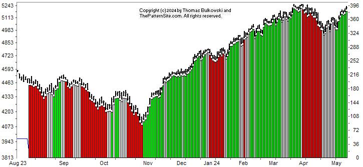
The above chart shows all of the signals as of Friday's close (and not updated until after next Friday's close), hiding the indicator line beneath the vertical bars. Vertical green bars are bullish, red ones are bearish, and white areas are neutral. The following charts clarify the signals.
The most recent signal was bearish on 09/12/2025.
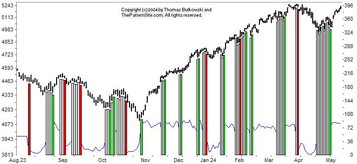
The above chart shows the bullish and bearish signal CHANGES. As with the other charts on this page, it is updated only ONCE each week, after Friday's close, but the chart uses the daily scale.
The S&P 500 Index appears as price bars on the top, and the indicator is the wavy blue line (which looks black) between the red and green bars near the bottom of the chart.
The last chart, below, shows the indicator by itself.
Signals can change for up to a week. If you do not understand why this happens, then read about the indicator construction, especially the warnings section.
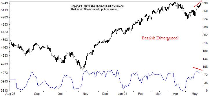
The chart pattern indicator line is not as important as the signals which it generates, but I have included a third chart of the indicator itself so you can check for divergence. Divergence often gives hints as to which way the index moves in the future.
Look for lower/higher peaks in the indicator while the index is going in the opposite direction (is making higher/lower peaks). The index will often follow the indicator,but it can take weeks before that happens.
The 2019 version of Patternz makes computing and charting the indicator easy. However, if you have the XP version, then refer to the program's setup as described on the CPI.html page. Click the link to be taken there.
-- Thomas Bulkowski
Support this site! Clicking any of the books (below) takes you to
Amazon.com If you buy ANYTHING while there, they pay for the referral.
Legal notice for paid links: "As an Amazon Associate I earn from qualifying purchases."
|
My Stock Market Books
|
My Novels
|
Warning: Dates on calendars are closer than they appear!![]()