As of 04/22/2026
Indus: 49,490 +340.65 +0.7%
Trans: 21,923 -2,010.03 -8.4%
Utils: 1,130 -3.53 -0.3%
Nasdaq: 24,658 +397.60 +1.6%
S&P 500: 7,138 +73.89 +1.0%
|
YTD
+3.0%
+26.3%
+5.8%
+6.1%
+4.3%
|
|
As of 04/22/2026
Indus: 49,490 +340.65 +0.7%
Trans: 21,923 -2,010.03 -8.4%
Utils: 1,130 -3.53 -0.3%
Nasdaq: 24,658 +397.60 +1.6%
S&P 500: 7,138 +73.89 +1.0%
|
YTD
+3.0%
+26.3%
+5.8%
+6.1%
+4.3%
|
|
As of 04/22/2026
Indus: 49,490 +340.65 +0.7%
Trans: 21,923 -2,010.03 -8.4%
Utils: 1,130 -3.53 -0.3%
Nasdaq: 24,658 +397.60 +1.6%
S&P 500: 7,138 +73.89 +1.0%
|
YTD
+3.0%
+26.3%
+5.8%
+6.1%
+4.3%
| |
|
| ||
Released 9/29/2023.
Below is the updated forecast for 2023 as of the close on September 29, 2023. Captions appear below the pictures for guidance, so be sure to scroll down far enough to read them.
On some of the charts (all except the CPI chart) the prediction in red is based on the work of Edgar Lawrence Smith in the 1930s. Smith said that the stock market followed a 10-year cycle. Each year tended to repeat the behavior of the year a decade earlier. In other words, if you averaged all years ending in 1 (2001, 1991, 1981 and so on), that would give you a forecast for 2011. For 2012, you'd make a similar average, only use 2002, 1992, 1982, and so on. That's what I did for the market forecast charts which follow.
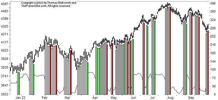
This is a chart of the Chart Pattern Indicator (CPI) on the daily scale.
The CPI again shows three bearish bars (vertical red bars), separated by neutral readings (white bars). The chart is bearish. I had hoped that we'd see a new upward move begin but it appears to have faltered.
I still believe we're near the end of the decline.
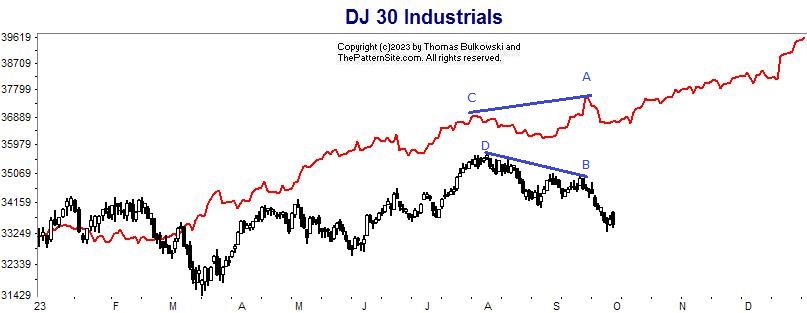
This is a chart of the Dow industrials on the daily scale.
The forecast is more optimistic than the actual Dow industrials. The forecast correctly predicted weakness in September.
We see divergence between point C to A which trends higher, versus the downward trend from D to B.
If the Dow follows the forecast, then expect the Dow to mover higher in this quarter.
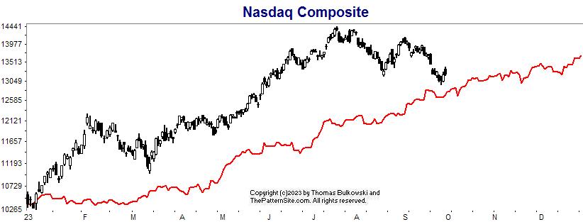
This is the Nasdaq on the daily chart.
The Nasdaq has done better than the forecast, but the gap between the two has narrowed. The forecast suggests the index will climb into year end.
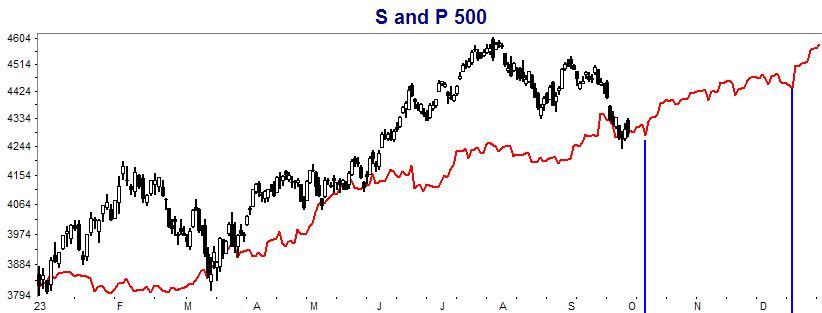
Here's the S&P 500 index on the daily scale.
The index has joined the forecast. Notice the vertical blue lines show anticipated weakness in early October and mid December. The forecast says to expect the index to rise, but stay below it's peak in July.
Support this site! Clicking any of the books (below) takes you to
Amazon.com If you buy ANYTHING while there, they pay for the referral.
Legal notice for paid links: "As an Amazon Associate I earn from qualifying purchases."
|
My Stock Market Books
|
My Novels
Orb Foresight Rewrite Coming!
|