As of 04/21/2026
Indus: 49,149 -293.18 -0.6%
Trans: 23,933 +611.01 +2.6%
Utils: 1,134 -18.16 -1.6%
Nasdaq: 24,260 -144.42 -0.6%
S&P 500: 7,064 -45.13 -0.6%
|
YTD
+2.3%
+37.9%
+6.1%
+4.4%
+3.2%
|
|
As of 04/21/2026
Indus: 49,149 -293.18 -0.6%
Trans: 23,933 +611.01 +2.6%
Utils: 1,134 -18.16 -1.6%
Nasdaq: 24,260 -144.42 -0.6%
S&P 500: 7,064 -45.13 -0.6%
|
YTD
+2.3%
+37.9%
+6.1%
+4.4%
+3.2%
|
|
As of 04/21/2026
Indus: 49,149 -293.18 -0.6%
Trans: 23,933 +611.01 +2.6%
Utils: 1,134 -18.16 -1.6%
Nasdaq: 24,260 -144.42 -0.6%
S&P 500: 7,064 -45.13 -0.6%
|
YTD
+2.3%
+37.9%
+6.1%
+4.4%
+3.2%
| |
|
| ||
Below is the updated forecast for 2025 as of the close on April 30, 2025. Captions appear below the pictures for guidance, so be sure to scroll down far enough to read them.
On some of the charts (all except the CPI chart) the prediction in red is based on the work of Edgar Lawrence Smith in the 1930s. Smith said that the stock market followed a 10-year cycle. Each year tended to repeat the behavior of the year a decade earlier. In other words, if you averaged all years ending in 1 (2001, 1991, 1981 and so on), that would give you a forecast for 2011. For 2012, you'd make a similar average, only use 2002, 1992, 1982, and so on. That's what I did for the market forecast charts which follow.
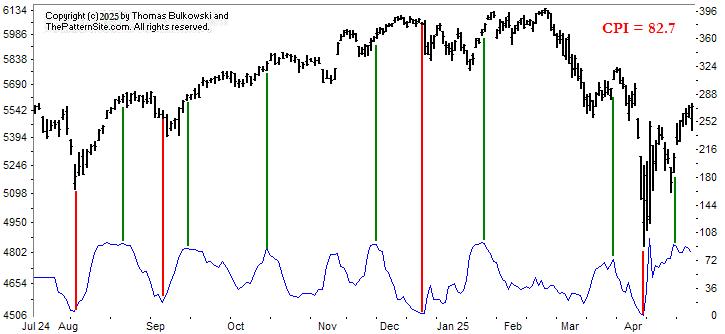
This is a chart of the Chart Pattern Indicator (CPI) on the daily scale.
I drew vertical red and green lines to highlight the peaks and valleys in the CPI versus the market. This is year-to-date. Signals above 65% are bullish, below 35% is bearish, with neutral between those two. Use the right scale for the CPI. We're currently bullish with a 82.7 reading.
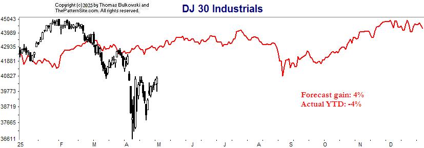
This is the Dow industrials on the daily scale. The forecast looks flat because of the tall swings the market has made this year. Expect weakness in August.

The Nasdaq looks similar to the Dow chart. Weakness in August and September. If the forecast is correct, the Nasdaq will gain 19 percentage points (down 10 to up 9). In other words, it's not a bad time to buy.
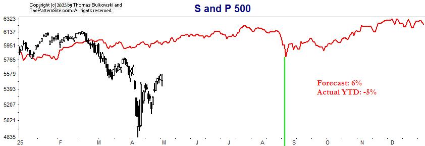
Similar chart, but using the S&P 500 index. Weakness in August (green line).
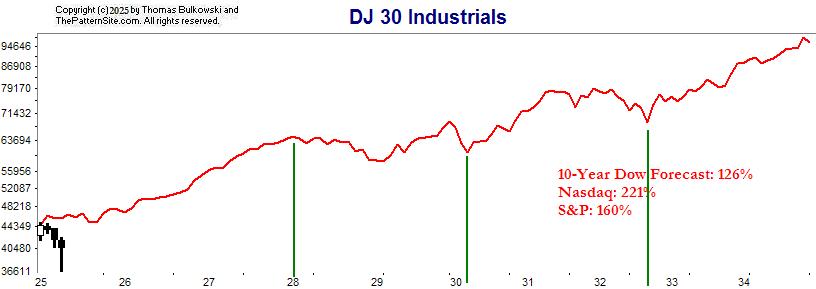
This is for Ronda.
In 2028, look for about 2 years of sideways movement. After that, the Dow climbs to 2035 with a stiff decline in 2032.
I also show the forecast gains for the three indices. Dow: up 126% in 10 years, Nasdaq: 221%, and S&P: 160%.
Support this site! Clicking any of the books (below) takes you to
Amazon.com If you buy ANYTHING while there, they pay for the referral.
Legal notice for paid links: "As an Amazon Associate I earn from qualifying purchases."
|
My Stock Market Books
|
My Novels
Orb Foresight Rewrite Coming!
|