As of 04/28/2026
Indus: 49,142 -25.86 -0.1%
Trans: 20,733 -111.00 -0.5%
Utils: 1,157 +1.83 +0.2%
Nasdaq: 24,664 -223.30 -0.9%
S&P 500: 7,139 -35.11 -0.5%
|
YTD
+2.2%
+19.4%
+8.3%
+6.1%
+4.3%
|
|
As of 04/28/2026
Indus: 49,142 -25.86 -0.1%
Trans: 20,733 -111.00 -0.5%
Utils: 1,157 +1.83 +0.2%
Nasdaq: 24,664 -223.30 -0.9%
S&P 500: 7,139 -35.11 -0.5%
|
YTD
+2.2%
+19.4%
+8.3%
+6.1%
+4.3%
|
|
As of 04/28/2026
Indus: 49,142 -25.86 -0.1%
Trans: 20,733 -111.00 -0.5%
Utils: 1,157 +1.83 +0.2%
Nasdaq: 24,664 -223.30 -0.9%
S&P 500: 7,139 -35.11 -0.5%
|
YTD
+2.2%
+19.4%
+8.3%
+6.1%
+4.3%
| |
|
| ||
Below is the updated forecast for 2024 as of the close on February 29, 2024. Captions appear below the pictures for guidance, so be sure to scroll down far enough to read them.
On some of the charts (all except the CPI chart) the prediction in red is based on the work of Edgar Lawrence Smith in the 1930s. Smith said that the stock market followed a 10-year cycle. Each year tended to repeat the behavior of the year a decade earlier. In other words, if you averaged all years ending in 1 (2001, 1991, 1981 and so on), that would give you a forecast for 2011. For 2012, you'd make a similar average, only use 2002, 1992, 1982, and so on. That's what I did for the market forecast charts which follow.
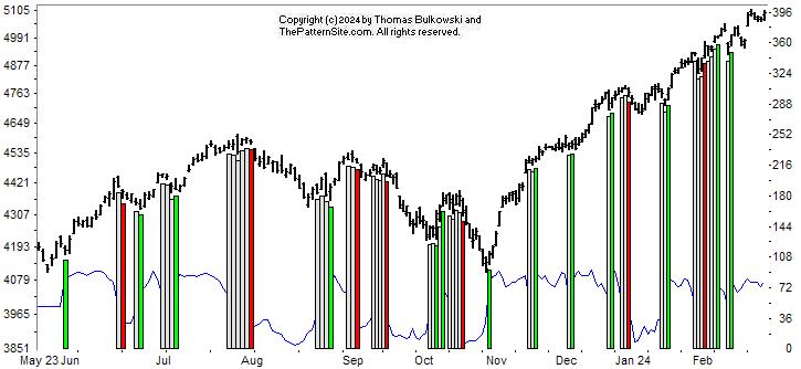
This is a chart of the Chart Pattern Indicator (CPI) on the daily scale.
The buy signal (green vertical bar on the far right of the chart) has been active for about two weeks now. There's a slight downward slope in the indicator line, though (thin blue line near chart bottom), suggesting weakness.
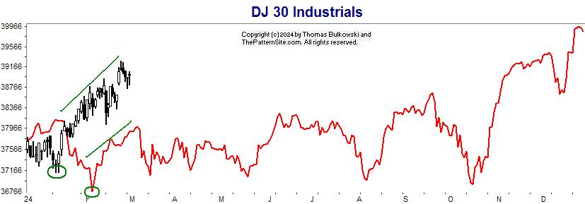
I show the actual bottom in the Dow versus the forecast, circled in green.
The two diagonally sloping lines correctly forecast an uptrend, but the timing has been off.
If the forecast for the rest of the year is correct, there's not a lot of upside left.
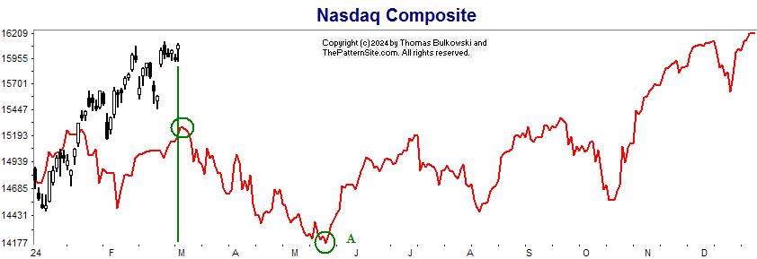
This is the Nasdaq on the daily chart with the forecast in red for 2024.
The green lines show the timing of the forecast peak with where we are on the actual index. It suggests a higher peak tomorrow (Friday).
The green circle at A shows the forecast low for the year. That's in mid May.
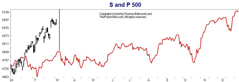
Here's the S&P 500 index on the daily scale for 2024
This is a chart similar to the prior one. It shows the relative timing of a forecast peak with the index. Again, there's not a lot of upside left but the forecast is rarely dead-on.
Support this site! Clicking any of the books (below) takes you to
Amazon.com If you buy ANYTHING while there, they pay for the referral.
Legal notice for paid links: "As an Amazon Associate I earn from qualifying purchases."
|
My Stock Market Books
|
My Novels
Orb Foresight Rewrite Coming!
|