As of 04/24/2026
Indus: 49,231 -79.61 -0.2%
Trans: 20,892 -198.95 -0.9%
Utils: 1,155 -2.30 -0.2%
Nasdaq: 24,837 +398.10 +1.6%
S&P 500: 7,165 +56.68 +0.8%
|
YTD
+2.4%
+20.4%
+8.1%
+6.9%
+4.7%
|
|
As of 04/24/2026
Indus: 49,231 -79.61 -0.2%
Trans: 20,892 -198.95 -0.9%
Utils: 1,155 -2.30 -0.2%
Nasdaq: 24,837 +398.10 +1.6%
S&P 500: 7,165 +56.68 +0.8%
|
YTD
+2.4%
+20.4%
+8.1%
+6.9%
+4.7%
|
|
As of 04/24/2026
Indus: 49,231 -79.61 -0.2%
Trans: 20,892 -198.95 -0.9%
Utils: 1,155 -2.30 -0.2%
Nasdaq: 24,837 +398.10 +1.6%
S&P 500: 7,165 +56.68 +0.8%
|
YTD
+2.4%
+20.4%
+8.1%
+6.9%
+4.7%
| |
|
| ||
Released 2/28/2023.
Below is the updated forecast for 2023 as of the close on February 28, 2023. Captions appear below the pictures for guidance, so be sure to scroll down far enough to read them.
On some of the charts (all except the CPI chart) the prediction in red is based on the work of Edgar Lawrence Smith in the 1930s. Smith said that the stock market followed a 10-year cycle. Each year tended to repeat the behavior of the year a decade earlier. In other words, if you averaged all years ending in 1 (2001, 1991, 1981 and so on), that would give you a forecast for 2011. For 2012, you'd make a similar average, only use 2002, 1992, 1982, and so on. That's what I did for the market forecast charts which follow.
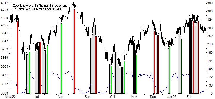
This is a chart of the Chart Pattern Indicator (CPI) on the daily scale. The most recent signal is bearish (the vertical red bar on the far right of the chart). It remains bearish, too. I expect the indicator will flip to bullish soon. Why? Because it has retraced about half the prior up move where trends frequently pause or reverse.
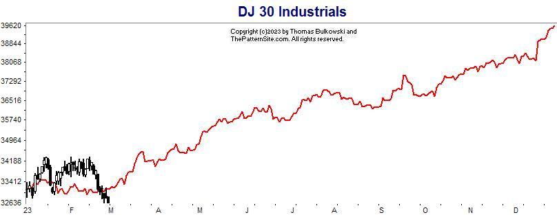
This is a chart of the Dow industrials on the daily scale. The 2023 forecast is in red, made at the start of January.
The index hasn't tracked the forecast, but it suggests the index will turn upward soon. That may not be the case, but I have hope.
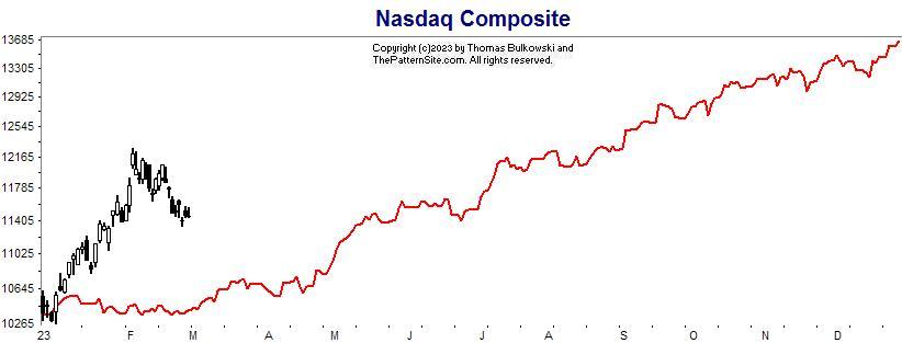
This is the Nasdaq on the daily chart.
The index shot upward right out of the gate in January and continued to soar until near the start of February. Since then, it has tumbled.
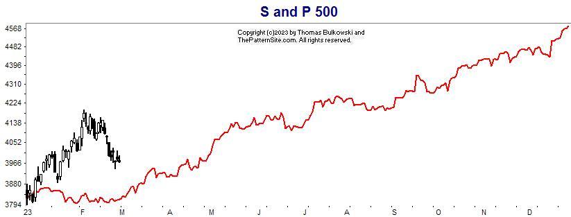
Here's the S&P 500 index on the daily scale.
This chart looks like the prior one. The index moved well above the forecast before starting its return to the red line. I expect the index to turn up soon, but that's just a guess.
Support this site! Clicking any of the books (below) takes you to
Amazon.com If you buy ANYTHING while there, they pay for the referral.
Legal notice for paid links: "As an Amazon Associate I earn from qualifying purchases."
|
My Stock Market Books
|
My Novels
Orb Foresight Rewrite Coming!
|