As of 04/28/2026
Indus: 49,142 -25.86 -0.1%
Trans: 20,733 -111.00 -0.5%
Utils: 1,157 +1.83 +0.2%
Nasdaq: 24,664 -223.30 -0.9%
S&P 500: 7,139 -35.11 -0.5%
|
YTD
+2.2%
+19.4%
+8.3%
+6.1%
+4.3%
|
|
As of 04/28/2026
Indus: 49,142 -25.86 -0.1%
Trans: 20,733 -111.00 -0.5%
Utils: 1,157 +1.83 +0.2%
Nasdaq: 24,664 -223.30 -0.9%
S&P 500: 7,139 -35.11 -0.5%
|
YTD
+2.2%
+19.4%
+8.3%
+6.1%
+4.3%
|
|
As of 04/28/2026
Indus: 49,142 -25.86 -0.1%
Trans: 20,733 -111.00 -0.5%
Utils: 1,157 +1.83 +0.2%
Nasdaq: 24,664 -223.30 -0.9%
S&P 500: 7,139 -35.11 -0.5%
|
YTD
+2.2%
+19.4%
+8.3%
+6.1%
+4.3%
| |
|
| ||
Released 4/4/2023.
Below is the updated forecast for 2023 as of the close on April 4, 2023. Captions appear below the pictures for guidance, so be sure to scroll down far enough to read them.
On some of the charts (all except the CPI chart) the prediction in red is based on the work of Edgar Lawrence Smith in the 1930s. Smith said that the stock market followed a 10-year cycle. Each year tended to repeat the behavior of the year a decade earlier. In other words, if you averaged all years ending in 1 (2001, 1991, 1981 and so on), that would give you a forecast for 2011. For 2012, you'd make a similar average, only use 2002, 1992, 1982, and so on. That's what I did for the market forecast charts which follow.
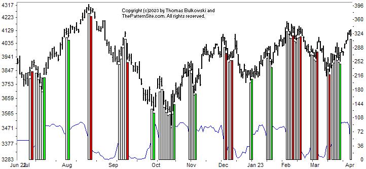
This is a chart of the Chart Pattern Indicator (CPI) on the daily scale.
As of today (Tuesday), the indicator flipped to neutral, which the white bar on the far right of the chart shows.
Look at the CPI line near the bottom of the chart. Notice the big drop it took in the last two or three days. Uh-oh.
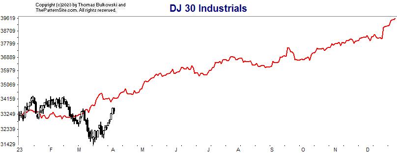
This is a chart of the Dow industrials on the daily scale.
If you imagine that the red line is a smoothed version of the Dow, then the forecast looks more accurate (but yes, it's still off). The Dow moved above the line and below it. Now, it's trying to climb back up to where it should be.
Notice that by year end, if the forecast is correct, the Dow should be comfortably higher than it is now.
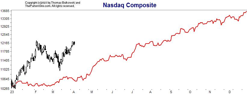
This is the Nasdaq on the daily chart.
The Nasdaq has outperformed the forecast...so far. Let's wait and see if it remains stronger going into year end.
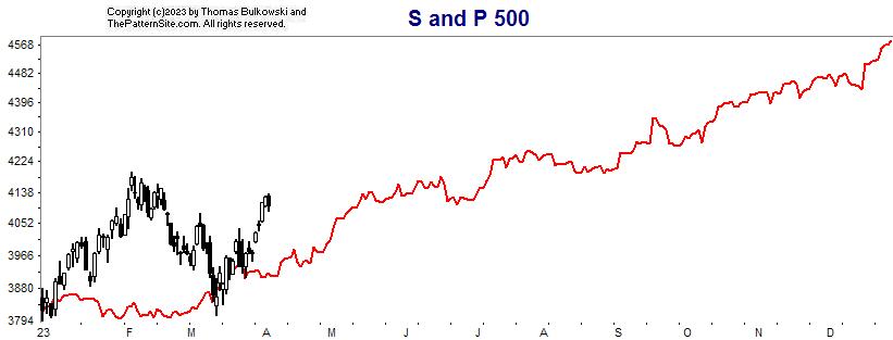
Here's the S&P 500 index on the daily scale.
The S&P also has shown strength so far this year. It remains above the forecast with an estimated close higher than it is now. Could the red line be acting as support? (Answer: probably not).
Support this site! Clicking any of the books (below) takes you to
Amazon.com If you buy ANYTHING while there, they pay for the referral.
Legal notice for paid links: "As an Amazon Associate I earn from qualifying purchases."
|
My Stock Market Books
|
My Novels
Orb Foresight Rewrite Coming!
|