As of 05/16/2024
Indus: 39,869 -38.62 -0.1%
Trans: 15,561 -20.59 -0.1%
Utils: 950 +0.34 +0.0%
Nasdaq: 16,698 -44.07 -0.3%
S&P 500: 5,297 -11.05 -0.2%
|
YTD
+5.8%
-2.1%
+7.7%
+11.2%
+11.1%
|
|
As of 05/16/2024
Indus: 39,869 -38.62 -0.1%
Trans: 15,561 -20.59 -0.1%
Utils: 950 +0.34 +0.0%
Nasdaq: 16,698 -44.07 -0.3%
S&P 500: 5,297 -11.05 -0.2%
|
YTD
+5.8%
-2.1%
+7.7%
+11.2%
+11.1%
|
|
As of 05/16/2024
Indus: 39,869 -38.62 -0.1%
Trans: 15,561 -20.59 -0.1%
Utils: 950 +0.34 +0.0%
Nasdaq: 16,698 -44.07 -0.3%
S&P 500: 5,297 -11.05 -0.2%
|
YTD
+5.8%
-2.1%
+7.7%
+11.2%
+11.1%
| |
|
| ||
Below is the updated forecast for 2024 as of the close on April 30, 2024. Captions appear below the pictures for guidance, so be sure to scroll down far enough to read them.
On some of the charts (all except the CPI chart) the prediction in red is based on the work of Edgar Lawrence Smith in the 1930s. Smith said that the stock market followed a 10-year cycle. Each year tended to repeat the behavior of the year a decade earlier. In other words, if you averaged all years ending in 1 (2001, 1991, 1981 and so on), that would give you a forecast for 2011. For 2012, you'd make a similar average, only use 2002, 1992, 1982, and so on. That's what I did for the market forecast charts which follow.
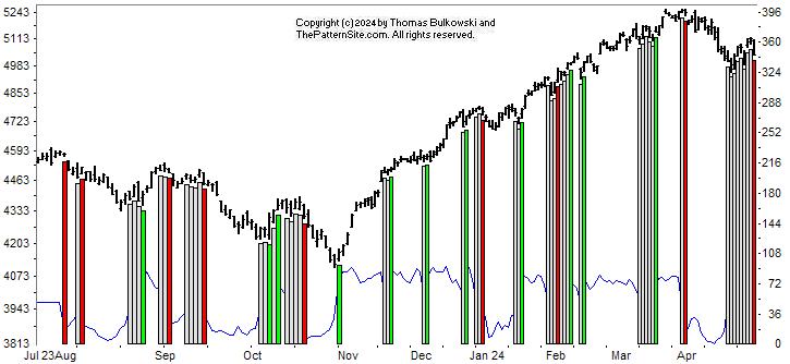
This is a chart of the Chart Pattern Indicator (CPI) on the daily scale.
With such a big decline in the index today (Dow industrials: down 570 points), it's no surprise that the CPI turned bearish. The vertical red bar on the far right of the chart shows this.
The cluster of signals (the white bars plus the red one) is worrisome. It could mean an extended drop coming.
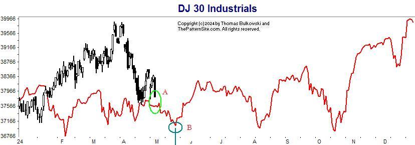
This is the Dow industrials on the daily scale. The forecast is in red.
This chart, of the three market indices, comes the closest to the forecast. I show the Dow heading lower at A, almost touching the prediction. If the forecast is correct, expect the market to continue lower until about mid month, B.
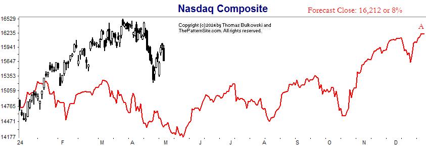
This is the Nasdaq.
The Nasdaq is well above the forecast. However, the forecasted gain this year is only 8% above the prior year's close, A.
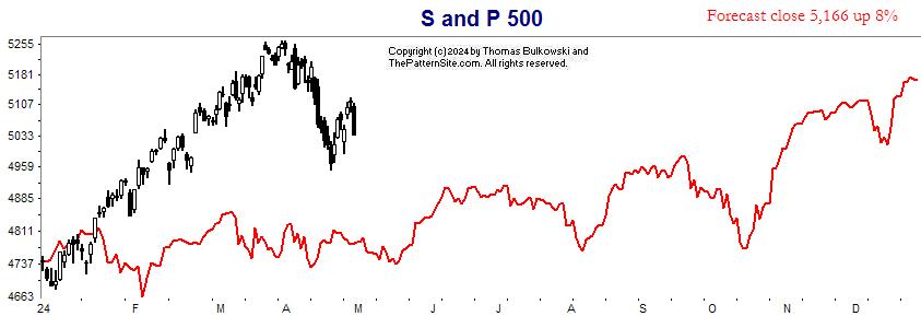
Here's the S&P 500 index on the daily scale for 2024
This chart is similar to the Nasdaq (prior chart). The index is far away from the forecast, and the close is predicted to be 8% higher this year.
Support this site! Clicking any of the books (below) takes you to
Amazon.com If you buy ANYTHING while there, they pay for the referral.
Legal notice for paid links: "As an Amazon Associate I earn from qualifying purchases."
|
My Stock Market Books
|
My Novels
|